Sahara soda branding
I decided to give myself the challenge of creating a brand for a fictional company specializing in making quality soda flavors. I noticed that beer labels have seen a huge rise in quality packaging design, but soda packaging design has been very stagnant over it’s lifetime. That’s why I wanted to create a brand that accurately displays the feeling and taste accompanying the can.

THE LOGO
After hundreds of sketches and revisions, I finally got to a point with this logo where I felt it was portraying what I wanted the brand to be. I knew I wanted it to be only logotype, but I also wanted to add some sense of implied illustration with the negative space it created. The reasoning for this was that the logo would be used on heavily illustrated packaging, so having an icon could distract
MIRAGE
With these flavors and their corresponding illustrations, I really wanted to play off different desert scenarios. For Mirage in particular, I wanted to portray a crashed plane half-buried in the sand. If someone was to see a plane in the middle of the desert, they would be unsure if they were actually seeing it or if it was, in fact, a mirage. I surrounded the scene with berry bushes to make the viewer question whether the berries and plane are symbols of hope, or of desperation.


OASIS
This flavor would be the standard Sahara flavor with a Citrus taste. I wanted to make this one feel peaceful and truly like a treasure in the middle of the desert. This illustration really encapsulates what I want the feeling of Sahara’s brand to be: a sense of relief and refreshment. This was the first packaging I designed for this brand, and it set the tone for the rest by framing the scene and fitting the illustration into the logo.
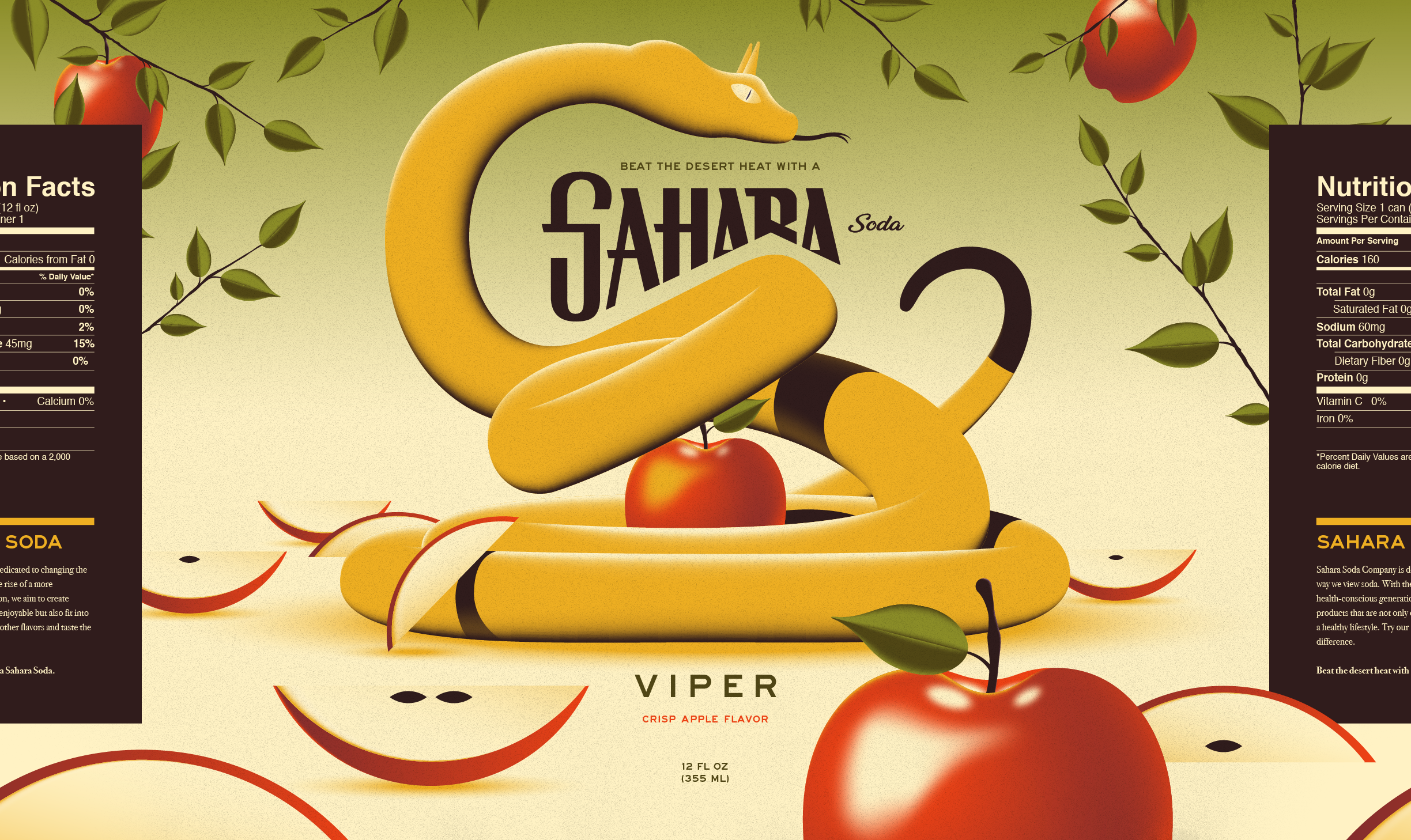
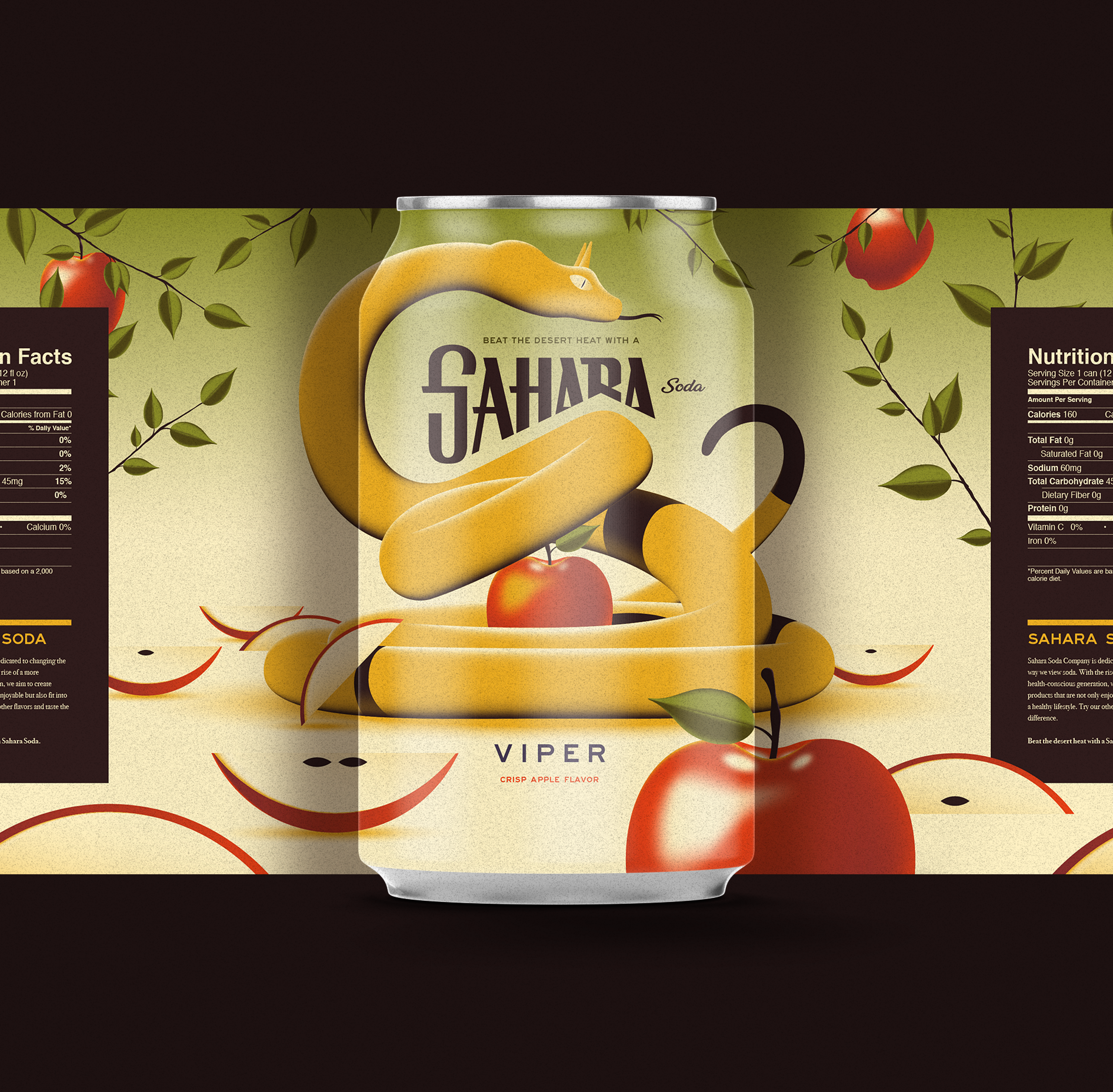
VIPER
The final flavor, Viper, is a crisp apple flavor. The snake in this illustration is based on the vipers found in the Sahara and is protecting an apple in its coils. I had a lot of fun designing this one and figuring out how to show the lighting in the scene. Overall I think these illustrations added a sense of excitement to the soda brand and would capture the customer’s attention on the shelf.